Skip to content
 SILENT-SI
Hearing sensitivity
Year:
2023
Client:
Final Degree Project
Service:
Web Design and Branding
Description
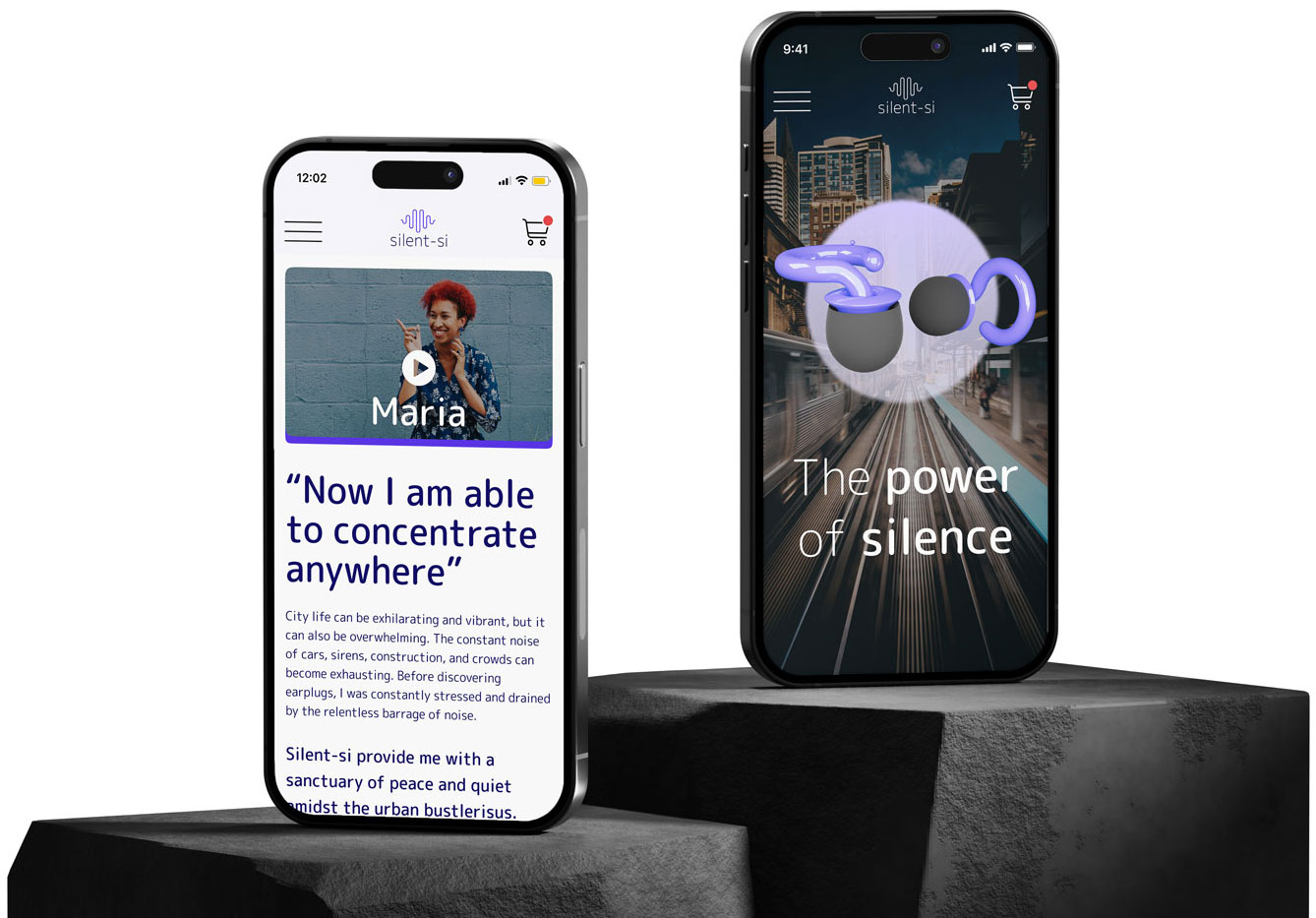
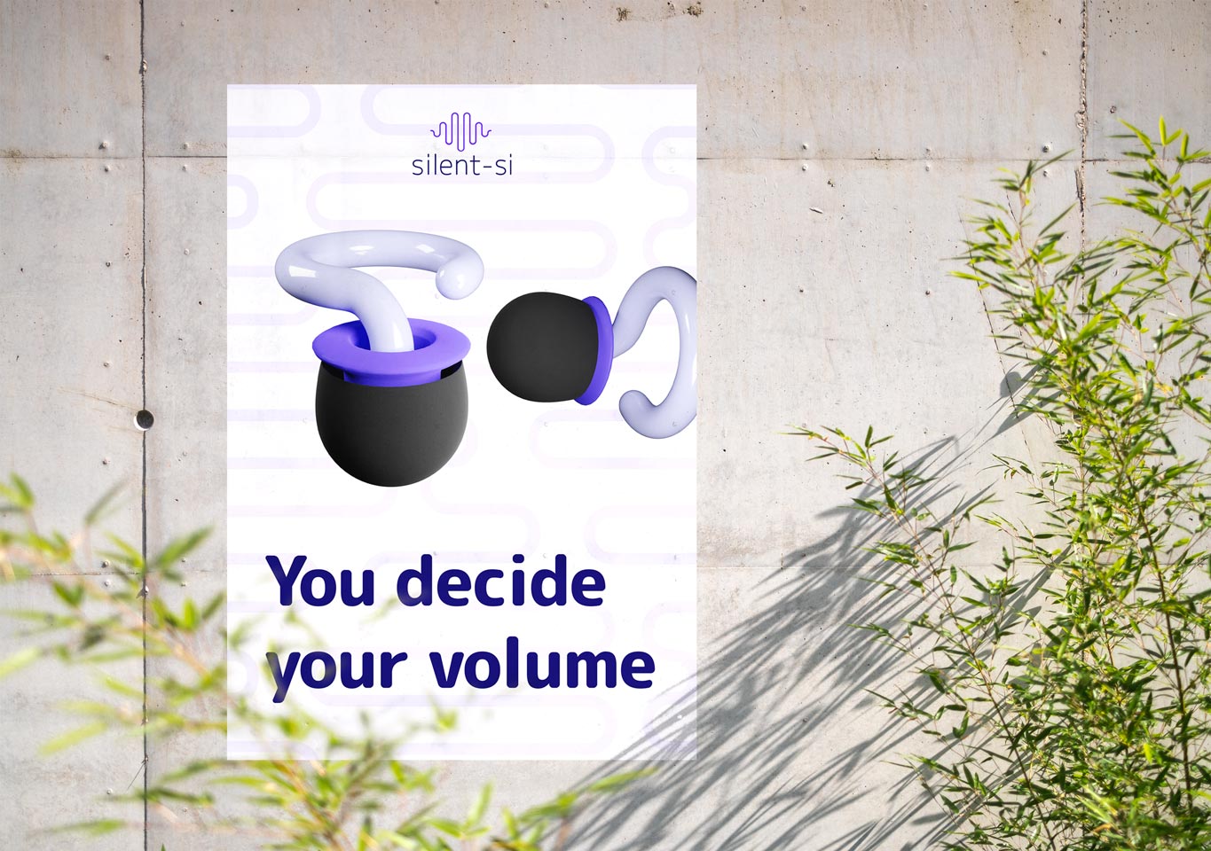
Silent-si was born from the need to create a product for hearing health. Everything that surrounds the brand had to breathe innovation, freshness and futurism. Regarding the e-commerce, it was important to use white spaces, so as not to overwhelm the user, since the "target" for this product is looking for calm and to get away from noise pollution.
Process
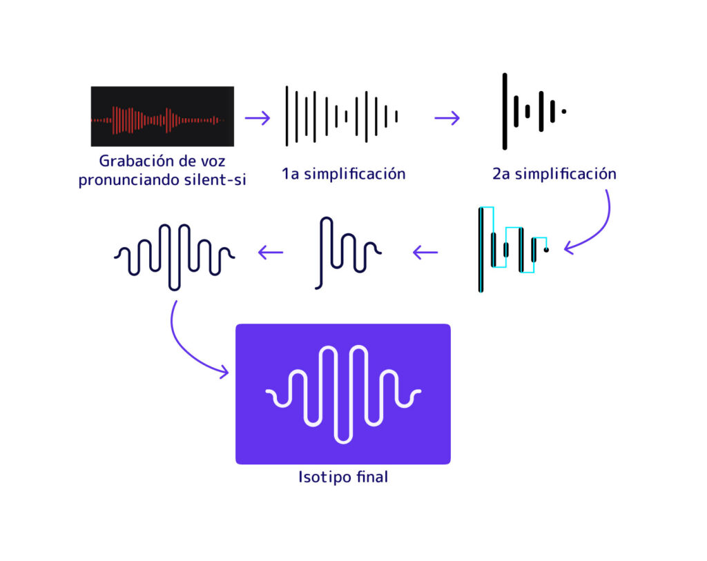
Branding was a dedicated process, starting with the isotype. This was done from a voice note. Oddly enough, that's right, by means of a voice note pronouncing the word silent-si we obtained the isotype layout.
Iconography, colors and details in order to homogenize the UI design.
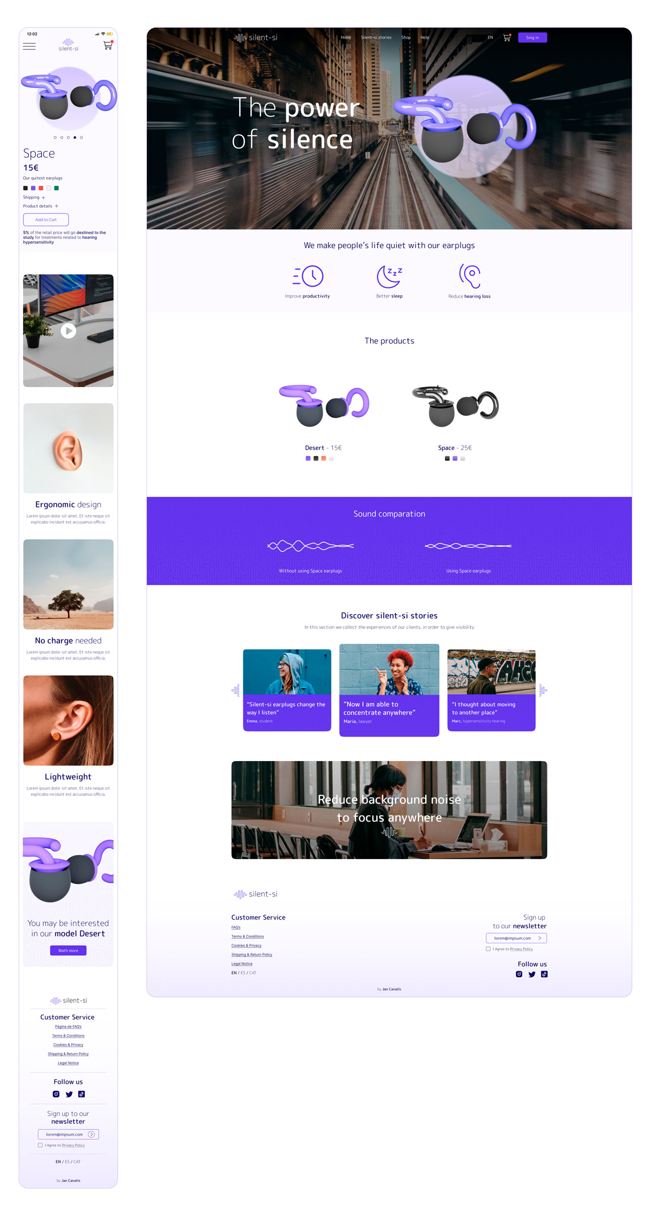
And with branding to go with it.
Next project