Skip to content
Button group
When designing a group of buttons, it is crucial that there is a clear and visible hierarchy between them. This hierarchy allows the user to immediately identify which is the main action, which is secondary, and which are additional options. To achieve this, use contrasts in the color, size, and visual weight of each button. For example, the button that leads to the primary action should be more prominent, either by its more vibrant color, larger size, or bold typography, while secondary buttons can be a more subdued color or have a lighter border. This differentiation helps guide the user intuitively, improving the user experience and reducing the possibility of errors.

Avoiding danger
One of the fundamental principles in UX/UI design is to protect the user from errors that can have negative consequences. Therefore, the button that is most appealing to the eye, whether by color, size, or location, must lead to a safe action. Imagine a button that is in a striking hue and in a central position: this button should perform an action such as “Save” or “Continue”, not something irreversible such as “Delete” or “Reset”. This approach ensures that even if the user acts impulsively or by mistake, the consequence will not be detrimental, which reinforces the user’s confidence in the system.

Showing the danger
The color red is universally associated with danger, warning or prohibition. In interface design, this color can be a powerful tool to warn users about actions that could have important or irreversible consequences, such as deleting data, closing an account or canceling a subscription. Using red for these buttons not only makes them stand out visually, but also triggers a psychological alert in the user, leading them to reconsider their decision before proceeding. However, it is essential not to overuse red to avoid confusion or desensitization; it should be reserved only for those actions that really require extra attention and consideration.

Adequate Copies
The copy or text on a button may seem minor, but its impact on usability is significant. Clear, concise and descriptive text ensures that the user understands exactly what will happen when the button is clicked.

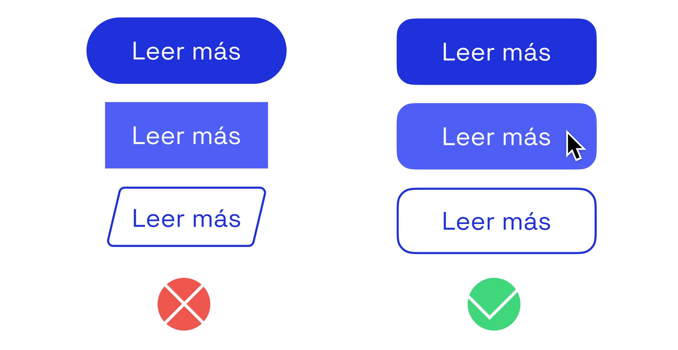
Homogeneous forms
Visual consistency is one of the pillars of good interface design. Buttons on your website or application should have a uniform shape and style so that the user recognizes them and easily associates them with clickable actions. If one button is rounded, all buttons should be rounded; if they have straight edges, the same applies. This consistency not only reinforces your product’s visual identity, but also makes navigation easier for the user, creating a smoother, distraction-free experience. Shape or style changes should only be applied if they have a clear functional reason, such as differentiating a primary action button from a secondary one, but always within a coherent design framework.